Hostile by Design: The Art of Turning Away the Wrong Visitors
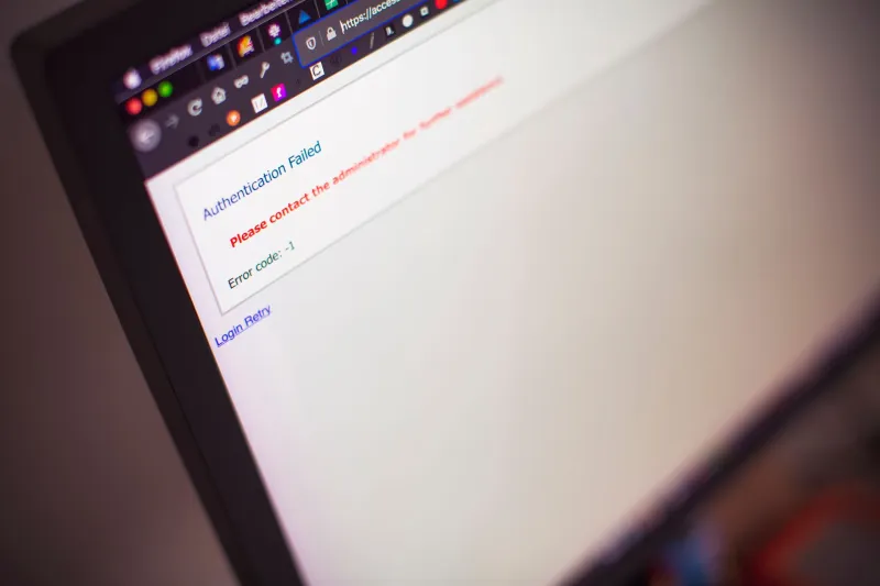
There is a peculiar discipline at work in some of the internet's least-visited spaces. It does not announce itself. It does not post a warning. It simply presents an experience so relentlessly unappealing—so committed to inconvenience—that most visitors close the tab within seconds, convinced they have stumbled into something broken or irrelevant. They have not. They have been evaluated, and they have been turned away.
This is anti-design as gatekeeping, and among certain communities it is practiced with the same intentionality that a Michelin-starred restaurant brings to its dining room layout.
The Friction Is the Point
Conventional web design wisdom holds that every additional click between a user and their desired content represents a failure. Conversion rates, bounce metrics, session durations—the entire vocabulary of modern UX treats user effort as waste to be eliminated. The sites operating under an opposing philosophy understand this perfectly. They have simply inverted the goal.
Consider the deliberate choices that accumulate into an effective deterrent: fonts rendered at sizes that require leaning forward, navigation menus that offer no obvious hierarchy, color schemes assembled from palettes that suggest either institutional neglect or active hostility. None of these choices are accidents in the communities that have adopted them as standards. They are, in the language of systems design, intended outputs.
The underlying logic is straightforward. Algorithmic discovery—the mechanism by which content surfaces to audiences who did not seek it—tends to reward legibility, speed, and visual clarity. A site that fails spectacularly on all three dimensions becomes, in effect, algorithm-proof. It does not appear in recommendations. It does not get shared widely. It does not attract the kind of ambient attention that converts a niche space into a crowded one.
Communities as Organisms
To understand why a community might choose this path, it helps to think of online spaces as organisms with immune responses. Any group that has watched a beloved forum, subreddit, or Discord server transform after an influx of new users will recognize the phenomenon: the shared vocabulary dilutes, the inside references require explanation, the norms that once felt self-evident become objects of debate. Growth, when it arrives without friction, often arrives as disruption.
Anti-design solves this problem at the point of entry rather than after the fact. A visitor who cannot immediately determine what a site is for, who finds its interface confusing and its aesthetic off-putting, will not stay long enough to require moderation. The community never has to articulate its norms defensively because the hostile surface does the work preemptively.
This approach has precedent in physical culture. Certain record stores in American cities have long cultivated an atmosphere of deliberate unwelcomeness—staff who do not offer assistance, organizational systems that reward knowledge and punish ignorance. The experience is not accidental. It is a filter, and the regulars who navigate it successfully understand that the difficulty is part of what they are paying for.
The Aesthetics of Earned Access
There is a secondary function to anti-design that goes beyond simple exclusion. For those who persist through the friction and find their way into a community that employs it, the aesthetic itself becomes a signal of belonging. Fluency in an ugly interface is a form of cultural literacy. Knowing which unlabeled link leads where, understanding the logic behind a navigation structure that appears to have none—these are forms of knowledge that cannot be faked by someone who arrived five minutes ago.
In this sense, anti-design creates what might be called earned aesthetics. The ugliness is not merely a barrier; it is a shared language that marks insiders. Those who have spent enough time in a space begin to read its apparent dysfunction as information-rich rather than information-poor. The broken-looking layout is, to them, entirely legible.
This dynamic mirrors certain traditions in American underground culture—zines photocopied until the text degraded, flyers designed to look like ransom notes, album covers that seemed to actively resist being picked up. The difficulty of the object communicated something about the community that produced it: we are not interested in your casual attention.
When Maintenance Becomes Method
Some of the most sophisticated practitioners of anti-design maintain their spaces in a state of apparent incompletion. Pages that look half-built, links that go nowhere, sections that promise content not yet delivered. For the uninitiated, this reads as abandonment. For the community that inhabits the space, it is a known quantity—a stable environment that simply does not perform stability for outside observers.
This distinction matters. Abandonment implies an intention that was never fulfilled. Deliberate incompletion implies an intention that is being fulfilled continuously. The site that looks broken to a stranger may be, to its regulars, operating exactly as intended.
The question of intent is, of course, impossible to resolve from the outside. That ambiguity is itself part of the mechanism. A site that might be abandoned, or might be intentional, or might be something else entirely—that uncertainty is its own form of friction. The curious visitor who cannot determine whether they are looking at a genuine community or a forgotten artifact will eventually stop looking.
The Limits of Hostility
Anti-design is not without its costs. Communities that rely on hostile aesthetics as their primary gatekeeping mechanism may find themselves sealed off from forms of growth that would actually serve them. New members who would contribute meaningfully are turned away alongside those who would not. Over time, spaces that never refresh their membership can calcify—their shared references aging, their conversations narrowing.
There is also the question of what happens when a community's hostility becomes its own kind of signal. In certain corners of the internet, the reputation for being difficult to access has attracted exactly the kind of attention that the difficulty was designed to prevent. The anti-design becomes a recommendation, and the filter begins to fail.
The communities that navigate this successfully tend to be those that treat their hostile aesthetics as living practice rather than fixed architecture. The interface evolves. The friction shifts. The space remains genuinely difficult to read, not because it has calcified into a monument to its own inaccessibility, but because it continues to actively resist legibility.
What the Void Selects For
Ultimately, anti-design is a philosophy of selection rather than exclusion. It does not refuse entry to specific people. It refuses entry to a specific kind of attention—the brief, the extractive, the algorithmically mediated. What it admits is patience: the willingness to sit with confusion, to return more than once, to treat difficulty as invitation rather than obstacle.
In a digital environment optimized at every level for frictionless consumption, that quality is rarer than it sounds. The sites that select for it are, in their way, selecting for something the broader web has largely abandoned—the idea that a space might be worth the effort it costs to enter.