Threshold Mechanics: The Digital Spaces Built to Test Your Resolve Before You Enter

There is a particular kind of stillness that arrives when a webpage refuses to load quickly. Not the frantic stillness of a broken connection, but something more deliberate—a pause that feels, unmistakably, intentional. The progress bar does not move. The spinner does not spin. The screen holds itself in a kind of suspension, and the question it poses is not technical. It is personal: How badly do you want this?
A growing subset of digital spaces has quietly adopted this posture as policy. Not through negligence or underpowered servers, but through considered design decisions that treat the entry process as a filter rather than a formality. These are the threshold mechanics of the modern web—systems engineered to make arrival feel earned.
The Waiting Room as Architecture
In physical space, we have long understood that the design of a waiting room communicates something about the institution beyond it. A sparse, fluorescent-lit DMV waiting area tells you one thing. A hushed, leather-chaired anteroom outside a private equity firm tells you another. Neither is accidental. Both are statements about who belongs inside and what kind of patience is expected of them.
Digital waiting rooms operate on the same principle, though the vocabulary differs. Here, the language is latency. It is the CAPTCHA that escalates its demands with each failed attempt. It is the two-factor authentication flow that routes a verification code through a method you haven't used in three years. It is the interstitial page that displays no content—only a single line of text that reads, without apology, Please wait while we confirm your eligibility.
These are not accidents of poor engineering. They are decisions. And the communities that build them understand something that mainstream platform designers have largely chosen to ignore: not every visitor deserves to become a user.
The Psychology of Punitive Verification
Researchers studying online behavior have noted a counterintuitive phenomenon sometimes called the effort justification effect—the tendency for people to assign greater value to outcomes they worked to achieve. The principle, borrowed from social psychology, suggests that difficulty itself can manufacture devotion. If you solved the puzzle, endured the wait, passed the invisible test, you are more likely to regard what lies beyond as worth protecting.
Certain communities have internalized this dynamic with remarkable precision. Private forums built around niche creative disciplines—experimental music, speculative fiction subgenres, underground game development—have been observed deploying multi-stage entry processes that can span days. An initial application may require a written statement. Approval may trigger a secondary verification sent through an obscure messaging protocol. A final confirmation might arrive with no explanation of what was confirmed or how.
By the time a new member posts for the first time, they have already demonstrated something. They stayed. They returned. They did not abandon the process when it became inconvenient. The community did not need to ask for commitment—it extracted it through procedure.
Loading Screens That Do Not Load
Perhaps the most philosophically stark expression of threshold mechanics is the loading screen that makes no visible progress. Unlike the conventional buffering animation—which at least performs the theater of effort—this variant simply exists. A static frame. A logo. Silence.
Users encountering these screens for the first time often assume malfunction. They refresh. They clear their cache. Some close the tab entirely. This, from the designer's perspective, is acceptable. Expected, even. The screen is not broken. It is sorting.
Those who wait long enough—thirty seconds, a minute, occasionally longer—eventually find themselves admitted. No explanation accompanies the transition. The content appears as though the delay never occurred. But something has shifted in the user's relationship to the space. They have already spent something to be there. And spending, in any currency, creates a stake.
Some developers building these experiences have described their intent in terms that sound less like UX philosophy and more like hospitality theory. One anonymous contributor to a small web development collective, writing on a platform most Americans would not recognize by name, framed it plainly: We are not being cruel. We are being honest. This place is not for everyone. The screen gives people a chance to realize that before they get inside.
Authentication as Ideology
Beyond loading delays and verification loops, a subtler form of threshold mechanics operates through authentication language itself. The phrasing of login prompts, error messages, and access-denied notices can function as a kind of ideological positioning—signaling the values and expectations of a community before a single piece of content is displayed.
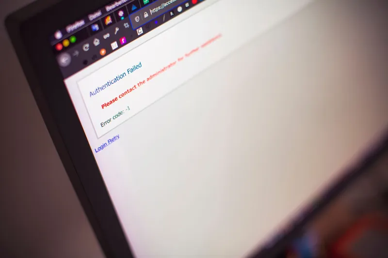
Consider the difference between Incorrect password. Please try again. and Access not granted. Review your credentials and reconsider your approach. The information conveyed is identical. The experience is not. The second formulation introduces a note of judgment—a suggestion that the failure may not be purely technical.
Some spaces take this further. Error messages written in the second person, addressing the user directly as though in conversation. Confirmation dialogs that ask users to affirm not just their email address but their intentions. Registration forms that include fields with no labels—blank inputs that demand to be filled without instruction, testing whether an applicant will ask for help or simply attempt an answer.
These elements are not universally admired. Critics argue that punitive design reproduces exclusionary dynamics that digital communities should be working to dismantle. The counterargument—offered by those who build such spaces—is that exclusion and curation are not synonyms, and that a community's right to define its own membership is itself a form of integrity.
What Remains After the Filter
The users who make it through these processes tend to describe their arrival in terms that sound disproportionate to the journey. Relief. A sense of having been recognized. Occasionally, something closer to belonging. These are not small feelings, and they do not emerge from frictionless onboarding flows.
There is something worth sitting with in that observation. The dominant logic of platform design in the United States has, for the better part of two decades, optimized for volume—for reducing every obstacle between a potential user and the point of conversion. The results of that optimization are visible in the scale of the platforms that succeeded, and in the texture of the communities those platforms produced.
Threshold mechanics propose a different logic. Not scale, but signal. Not everyone, but the right ones. The waiting room, in this framing, is not a failure of welcome. It is the welcome itself—extended, unhurried, and addressed only to those who understand that some doors are worth waiting in front of.
The screen holds. The cursor blinks. Somewhere, a decision is being made—not by an algorithm, but by the person sitting in front of it, deciding whether this particular void is worth the patience it demands.